Balance in photography is the result of the arrangement of visual elements within the frame so that there is an even distribution of visual weight. This balance can be achieved through the use of shapes, light, shadows, volumes, lines, and tonal masses. It is about how these elements are arranged, how they interact within the visual field, and how a perceptible stability is generated in the image. In photography, the human eye tends to seek organization and order; therefore, when an image presents an equitable distribution, whether symmetrical or asymmetrical, it generates a balanced response that is pleasing to the eye. The balance of the formal relationships between the components of the image.
In the work of Henri Cartier-Bresson, for example, one can observe a visual structure rigorously constructed from the framing and the geometry of the scene. In his photograph of Hyères (1932), the cyclist descending a curve occupies the lower left corner of the frame. To the right, at the top, there is a railing that descends diagonally. The curve of the stairs creates a spiral, and the vertical and horizontal walls divide the plane into clear shapes. Although the elements are not distributed symmetrically, a balance is achieved through the counterpoint between the moving figure at one end and the structural lines at the other. Formally, the visual weight of the cyclist is balanced by the repeated diagonals and the proportion of the space occupied. Light and shadow generate high-contrast zones that help delineate areas of visual tension, and it is in this tension that balance is generated: the viewer’s eyes scan the image following rhythmically repeating trajectories.
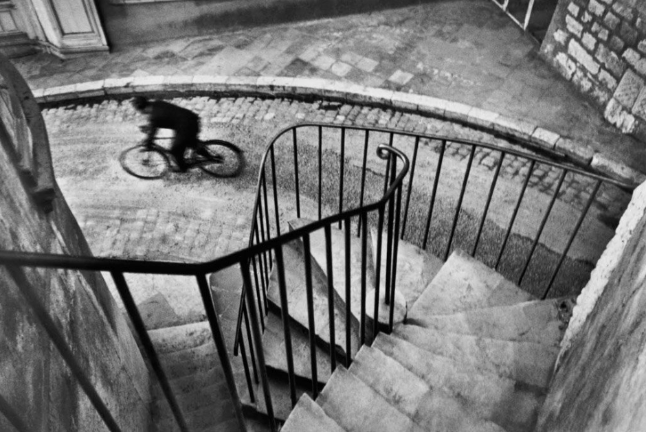
Henri Cartier-Bresson
Ansel Adams, for his part, worked meticulously with the zone system to control tonal contrast throughout the image. In his Yosemite landscapes, such as in «Moonrise, Hernandez, New Mexico,» the composition is structured through horizontal bands: at the bottom, a dark strip with the white crosses of the cemetery; in the center, a light gray terrain with small houses; and at the top, a dark sky with a bright white moon. In purely formal terms, the image is divided into zones with distinct tonal masses. The contrast between the black of the sky and the white of the moon creates a focal point that is balanced by the white crosses at the base of the image. The circular shape of the moon, placed near the right edge, is balanced by the repetition of small, rectangular shapes in the lower left. The balance here is achieved not by symmetry, but by compensation of visual masses: the smaller but brighter area of the moon is balanced by a larger, lower-contrast area in the lower plane.
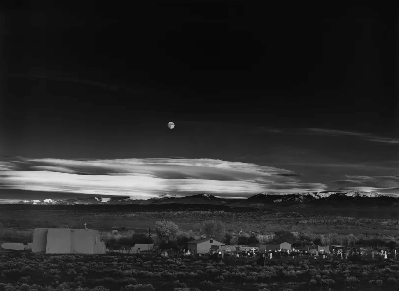
Ansel Adams
In Eve Arnold’s case, especially in her more restrained portraits, a balance based on the relationship between the subject and their surroundings can be observed. In this photograph, composition and balance are evident. The scene, captured in black and white, reveals a figure in a bathtub, seen through a doorway. The bathtub and the person immersed, their head covered, are the central focal point. Above, a clothesline with clothing, including underwear, hangs in the background, adding horizontal and vertical lines that intersect with the curvature of the mirror behind the bathtub. To the right, in the foreground, part of a chair with objects can be seen, visually anchoring the right side and balancing the negative space and shadows that predominate at the edges. The tonal contrast of black and white, with highlights highlighting the figure and the reflection in the mirror, and deep shadows defining the space, contributes to a notable visual depth. The distribution of elements in the foreground, middle ground, and background, along with the lines suggested by the bathroom architecture and the clothes hanging on the line, guide the viewer’s gaze fluidly, resulting in a harmonious and well-balanced composition.

Gregory Crewdson works with compositions of extreme formal precision. In a typical image from his Twilight series, a human figure is positioned inside a room, often centered or slightly off-center, while lighting comes from multiple sources: internal lamps, exterior lights entering through windows, and reflections. Formally, the image is divided into layers of depth. The lines of furniture, doors, and windows create an interior frame that organizes the space. The human figure is usually lit with medium intensity, which places it midway between the bright extremes of the frame. Balance is achieved by distributing these points of light and shadow in opposition: a lit lamp on the right can be balanced by a lit window on the left; a dark sofa can visually offset a light wall. Rectangular shapes predominate, and their lateral arrangement allows for an almost mathematical visual division of space. Balance is achieved by absolute control of the tonal masses and the proportion of the elements within the frame.
Gregory Crewdson
In Lee Miller’s photography, specifically in his studio portraits and architectural compositions, one can observe a refined use of chiaroscuro and diagonals as balancing mechanisms. The photograph «Model wearing Digby Morton Suit, London, England, 1941» depicts an elegantly dressed woman in a two-piece suit and hat, gloves, and low heels, positioned centrally beneath a sturdy brick arch that frames her. Behind her stretches a devastated cityscape, with ruined buildings and rubble, and a barely legible sign on the left. High-contrast lighting accentuates shapes and textures. The composition achieves a remarkable balance thanks to the natural framing of the arch, which draws the eye toward the model; its central location, which lends visual weight; the marked tonal contrast between the figure and the devastated background, which makes her stand out; and the combination of the structural symmetry of the arch with the asymmetry of the ruined setting, creating an image with depth and a dynamic balance between order and chaos.

Lee Miller
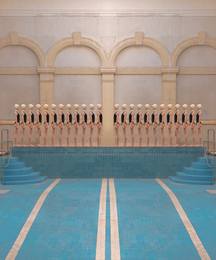
A contemporary example of the use of balance from a formal perspective is the work of photographer Maria Svarbova. Her carefully constructed images demonstrate an absolute mastery of shapes, colors, and spatial arrangement. In her series, such as Swimming Pool, the subjects are symmetrically placed within minimalist architectural settings. The rectangular shapes of the pools, windows, and walls act as geometric frames that divide the shot into balanced sections. The human figures are arranged equidistantly, creating repeating or alternating patterns. Color acts as a powerful formal element, and the soft light, free of harsh shadows, is distributed evenly throughout the image, avoiding areas of high contrast that could disrupt the equilibrium. Balance in Svarbova’s works is achieved through symmetry, chromatic harmony, and the exact spatial proportion between subjects and architecture.
In general terms, balance in photography can be analyzed as the relationship between visual masses interacting in a two-dimensional space. These masses can be areas of color, shadow zones, geometric figures, or groupings of lines. A white circular shape can have the same visual weight as a dark rectangular shape, if its proportion and position allow it. The visual center of an image does not always coincide with the geometric center; the human eye tends to favor the top and right sides of the frame. Therefore, an element placed in the lower left requires greater visual weight (whether through size, contrast, or shape) to balance a lighter element placed in the upper right. Diagonals, implicit triangles, partial symmetries, and reflections are recurring structures that help stabilize the composition. Likewise, tonal contrast is an effective mechanism for distributing attention and thus generating balance.
In conclusion, when analyzing balance in photography from a strictly denotative perspective, it becomes clear that visual balance does not depend on narrative content or emotion, but rather on the structural relationship between visible elements. Balance is a matter of proportion, rhythm, and contrast. Observing an image from this perspective allows us to understand how it is visually constructed, regardless of what it represents. It is a way of reading the image as an architecture of forms and light, where each component occupies a specific place within a spatial logic. The photographer who masters formal balance can organize the image precisely, direct the viewer’s gaze, and generate a clear perceptual response. Balance is, in essence, a strategy of visual organization, and its denotative analysis reveals the structural basis of every great photograph.

Deja un comentario